
Overview
When Cambridge University Press and Cambridge Assessment announced their merger, my team at Make it Clear was tasked with designing a joint design system for the new organisation.
Working to a tight deadline, I helped turn a complex collection of existing digital experiences into a shared set of building blocks for the new ecosystem. The goal was to create something consistent enough to feel like one organisation, while still giving different business areas the flexibility they needed.
Challenge
Bringing two large, established organisations together meant bringing together a complex collection of existing digital experiences. Both institutions had multiple business areas, each with its own audiences, content and visual identity.
The new ecosystem needed to make navigating between these areas feel seamless, while giving each one enough room to communicate what made it distinct. The challenge was to find the structure underneath all this complexity, identifying which patterns could be shared, which needed variations and how they should work across different content and contexts.
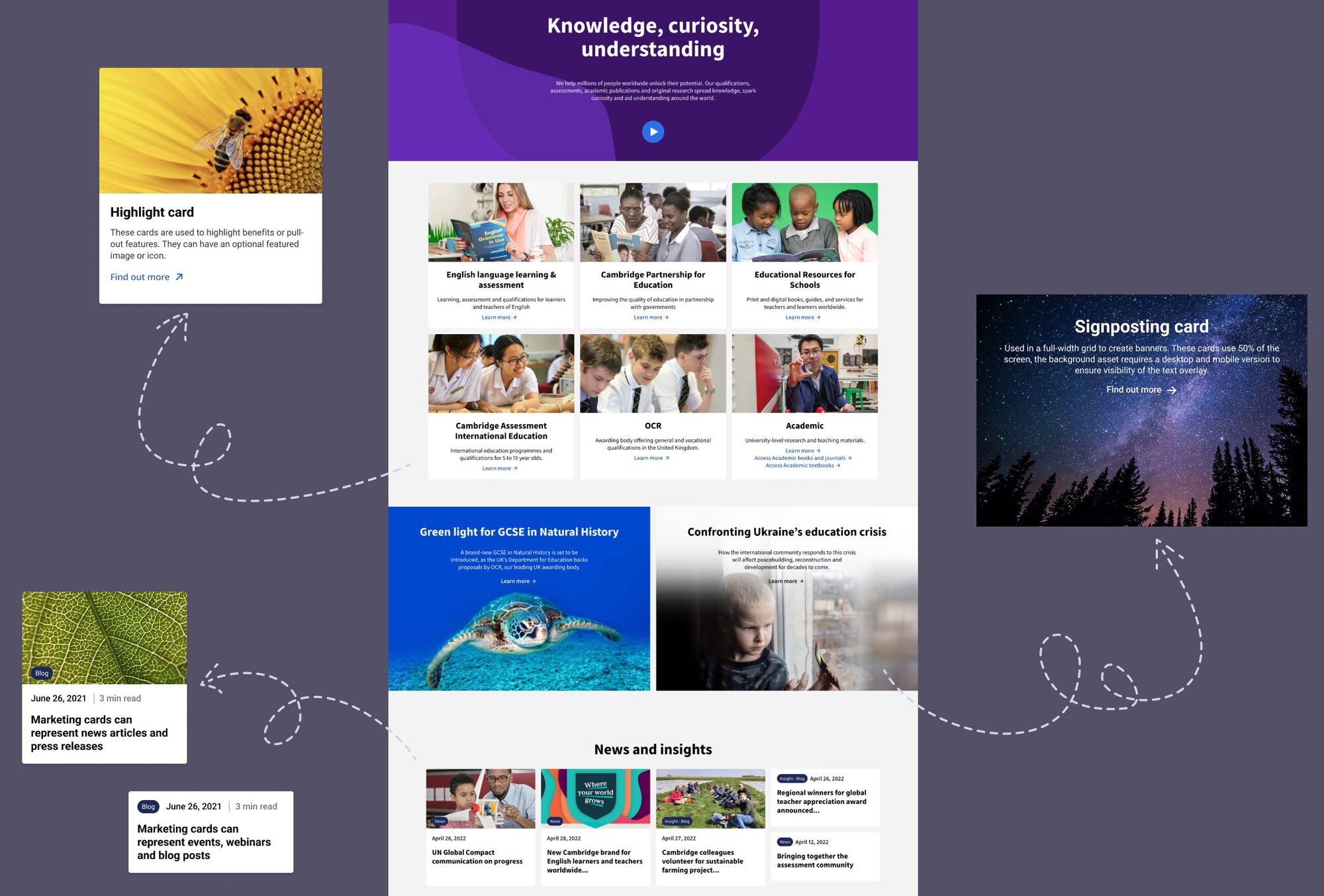
My role
I was the lead designer responsible for the UX and UI of the design system and its supporting templates. I defined its structure and requirements, created functionality specifications and wireframes, developed the UI design, conducted usability testing and managed the handover to development.
Process
Auditing the existing ecosystem
I started with a workshop with key stakeholders to understand the requirements of each business area. This identified twelve priority page templates that would form the basis of the new system.
Each template had multiple variations across the organisation, so I gathered and reviewed up to thirty examples of each page. This gave me a detailed picture of the existing ecosystem and helped uncover recurring patterns, variations and edge cases.
Defining the building blocks
I translated the findings from the audit into a detailed functionality specification, documenting the components, their content requirements and functionality in a single spreadsheet for the client to review. This gave us a shared reference for deciding what the new design system needed to support.
Designing the system in context
Once the specifications were approved, I created wireframes for the priority templates.
Although the main deliverable was the design system, seeing the components within real page templates allowed us to test how they worked together and identify missing variations.
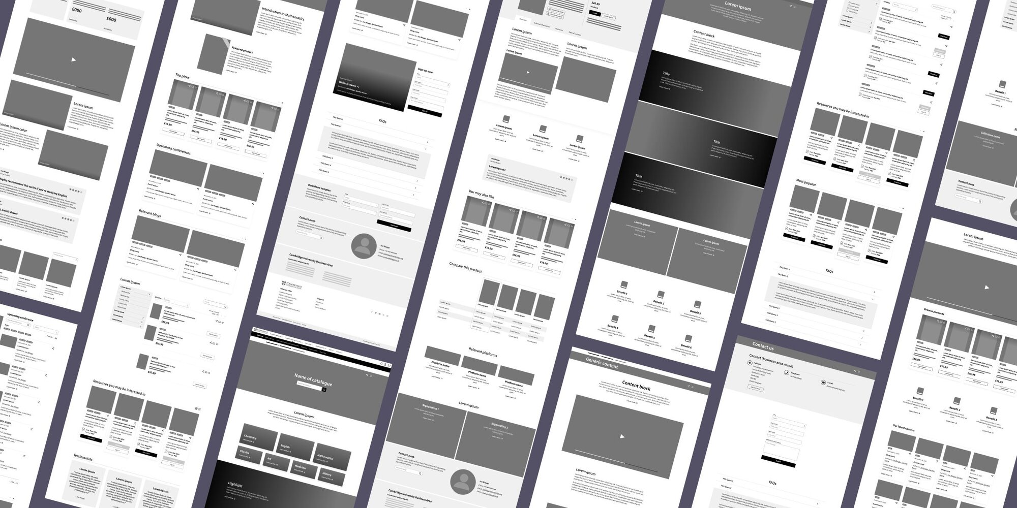
I deliberately designed for the worst-case scenario, including every relevant component type and variation within each template, even though no individual page would use them all at once. This helped uncover the full range of requirements and edge cases to account for.
Creating a flexible visual language
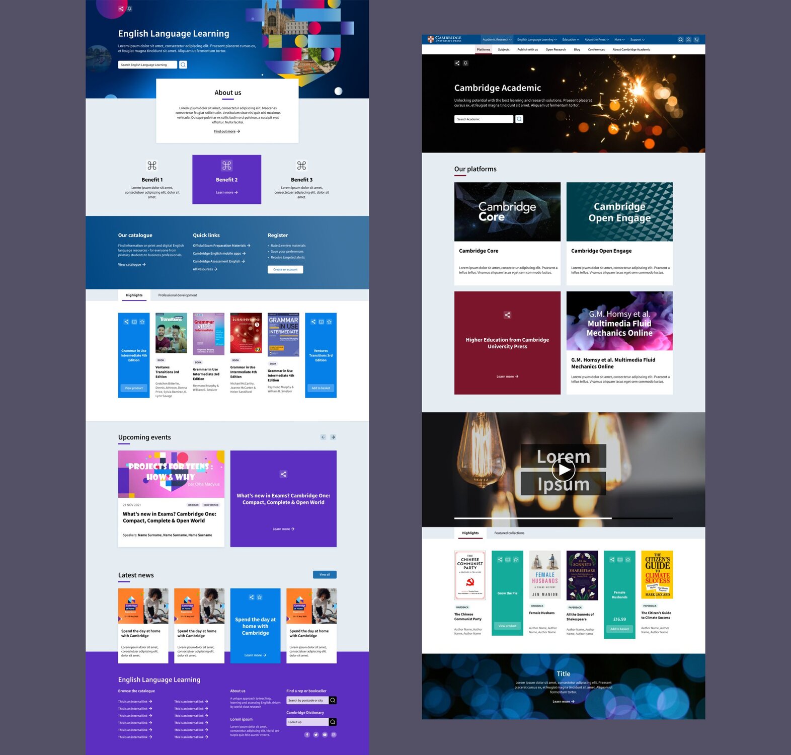
I worked on one of two conceptual directions for the new interface, creating UI prototypes for the organisation's homepage and three landing pages for different business areas.
These prototypes demonstrated how a shared visual language could be applied consistently while still allowing individual business areas to retain elements of their own identity.
Testing the experience
I conducted eighteen usability testing sessions with a mix of internal and external users and reported on the findings. This helped us validate the proposed structure and identify areas for improvement before the system was finalised.
Building the design system
Once we agreed on the visual direction, I applied it across the entire design system.
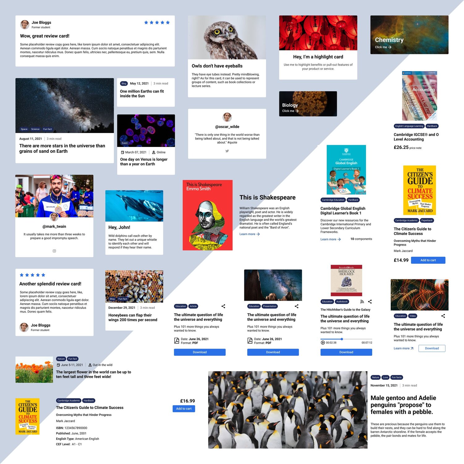
Using Atomic Design principles, I structured the library into atoms, molecules and organisms, which could then be combined to create the site templates. Each component accounted for the different content, interaction and responsive states identified during the earlier audit.
Documenting how it works
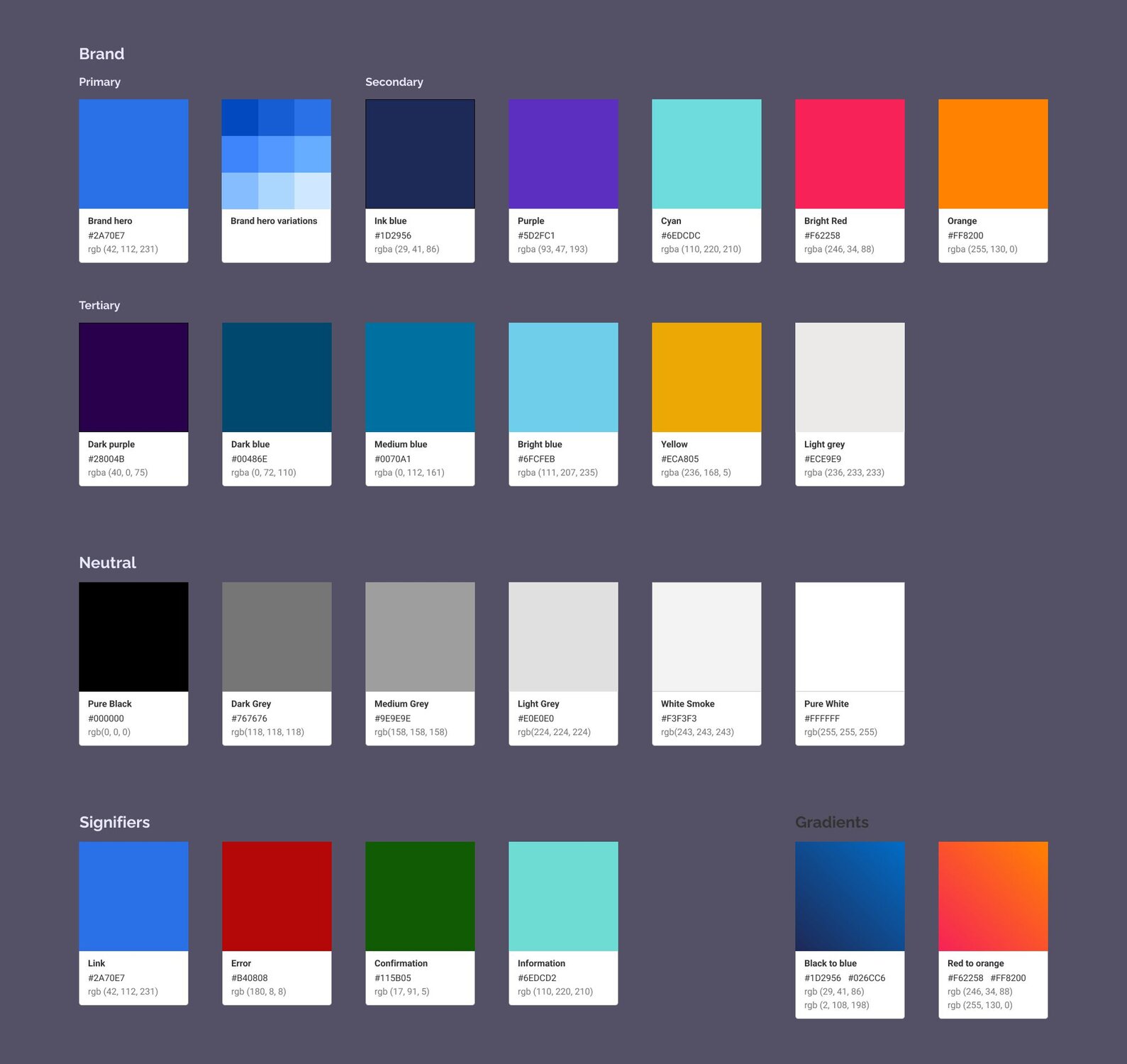
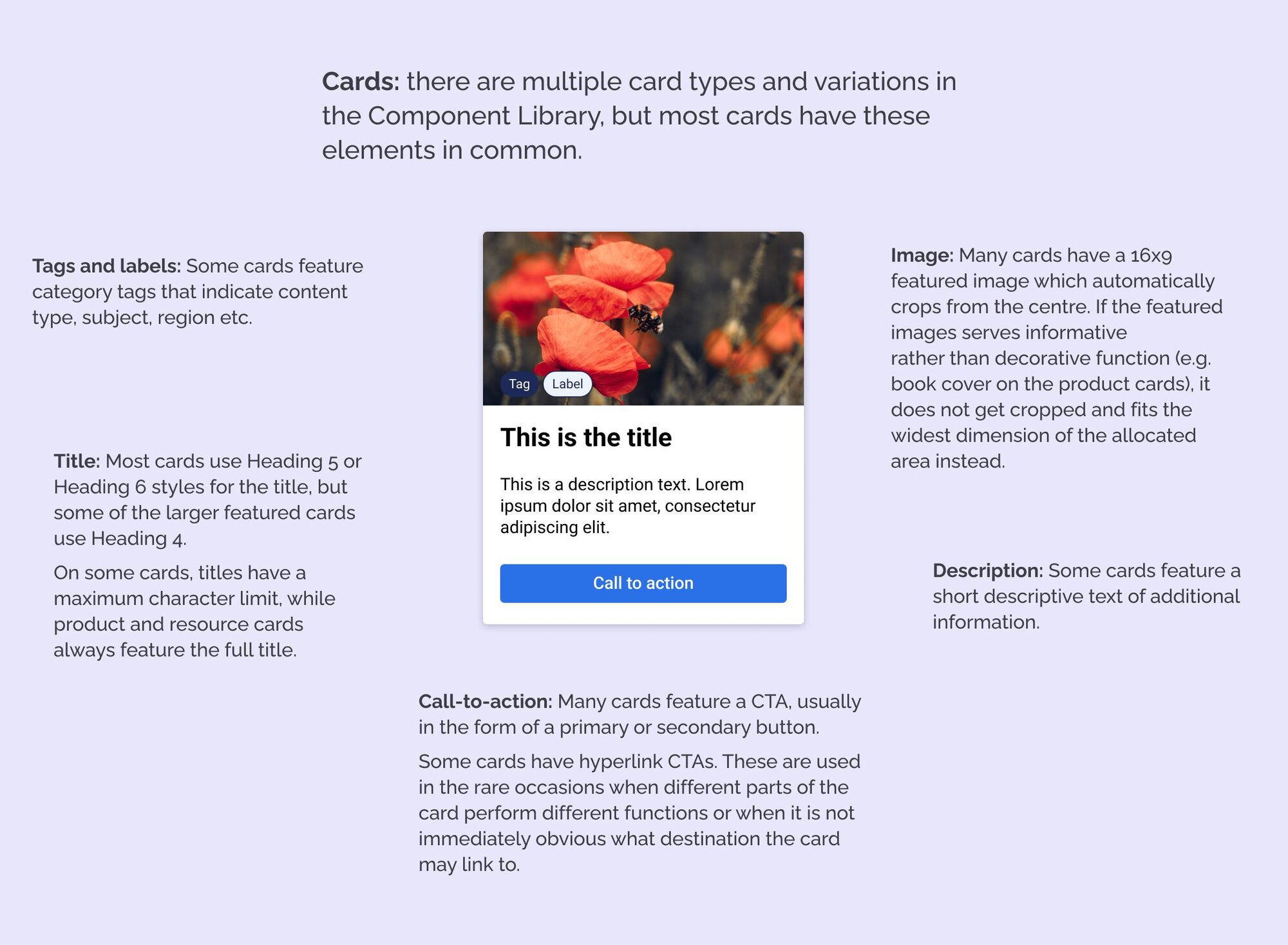
Finally, I created a style guide explaining the principles behind the system and how its components should be used.
It covered colour and typography alongside the functionality, interaction and responsive behaviour of each component type, giving the client a practical reference for using and extending the system.
Conclusion
The resulting design system gave the newly merged organisation a shared foundation for building its digital ecosystem.
Rather than designing each business area independently, teams had a common set of components, patterns and principles that could be adapted to different requirements, while maintaining a consistent experience.
For me, this design system project was about making sense of a complex and varied digital ecosystem and creating consistency without compromising on flexibility.