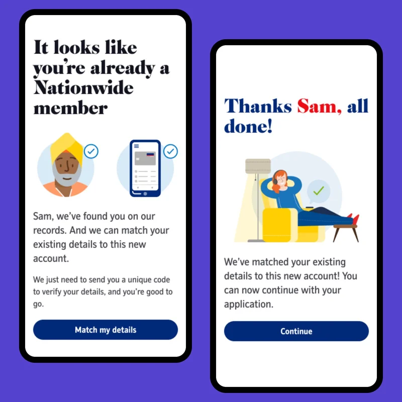
Overview
I worked at Nationwide for eighteen months as part of a three-person Experience Design team focused on savings account applications. While our immediate scope was savings, we identified a wider problem: account applications across Nationwide had evolved independently, resulting in inconsistent experiences and repeated solutions to the same problems.
I led the creation of a UX pattern library that captured the principles and patterns needed to create a more consistent experience across all account applications. Starting with savings products, including ISAs and bonds, we created a foundation that could be applied across other journeys and gradually used to modernise the wider experience.
Challenge
Nationwide was the first UK provider to launch an internet banking service, in 1997. Over the decades that followed, its digital ecosystem grew organically, with different channels and products developed and maintained independently.
This was particularly visible in account applications. Although many journeys solved similar problems, they often did so in different ways. Users had to repeatedly learn how to interact with different applications, increasing cognitive load and undermining trust. For product teams, it also meant repeatedly solving similar problems, reducing efficiency and slowing down innovation.
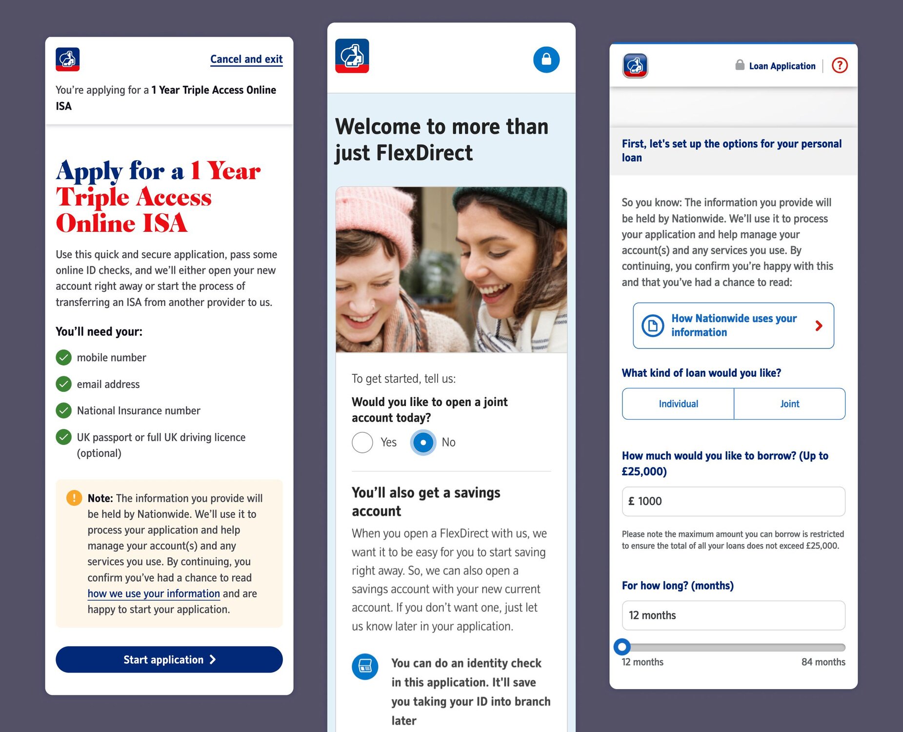
The opening pages for the current account, savings account, and credit card or loan application are inconsistent and show evidence of independent design decisions that have not been aligned.
The Nationwide Experience Language (NEL) design system had already established a shared visual language through a library of UI components and style guidance. However, it primarily covered individual interface elements and did little to explain the principles that bring them together into a unified experience.
To address this gap, my team created a UX pattern library that documents the usability principles for application form designed to be reusable across Nationwide.
My role
I led the creation of the UX pattern library from initial proposal and stakeholder buy-in through to implementation and ongoing maintenance.
Working with a UI and content designer, I helped identify and prioritise the patterns, defined the underlying usability principles and facilitated alignment with the wider product team. I also led a two-day future-state workshop, synthesised research and created the structure and templates for the library.
Process
Mapping the existing experience
We began by gathering visual references from existing savings applications, as well as selected current account and loan journeys.
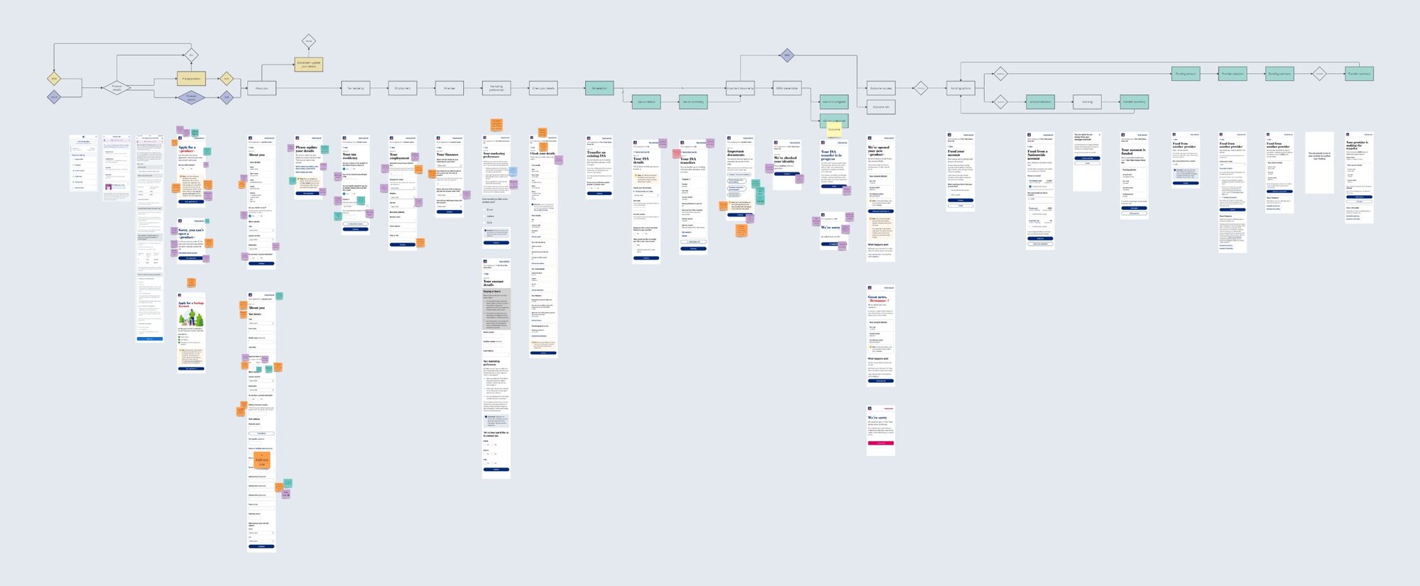
Full savings account application flow with annotations on design improvements and inconsistencies.
Rather than simply cataloguing screens, we looked at the purpose of each interaction and grouped them into reusable patterns. Some related to individual pages, such as application or funding outcome screens. Others represented multi-step activities, such as collecting personal details. We also identified cross-cutting patterns such as errors, warnings and timeouts, which could appear in different forms throughout a journey.
This gave us a framework for understanding the existing experience and identifying where consistency would have the greatest impact.
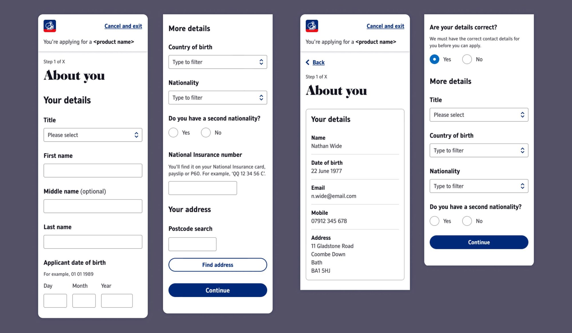
Some design patterns, like a transfer of an ISA, consisted of multiple screens. These, in turn, followed individual templates, such as summary pages or outcomes, which had to be aligned across multiple design patterns.
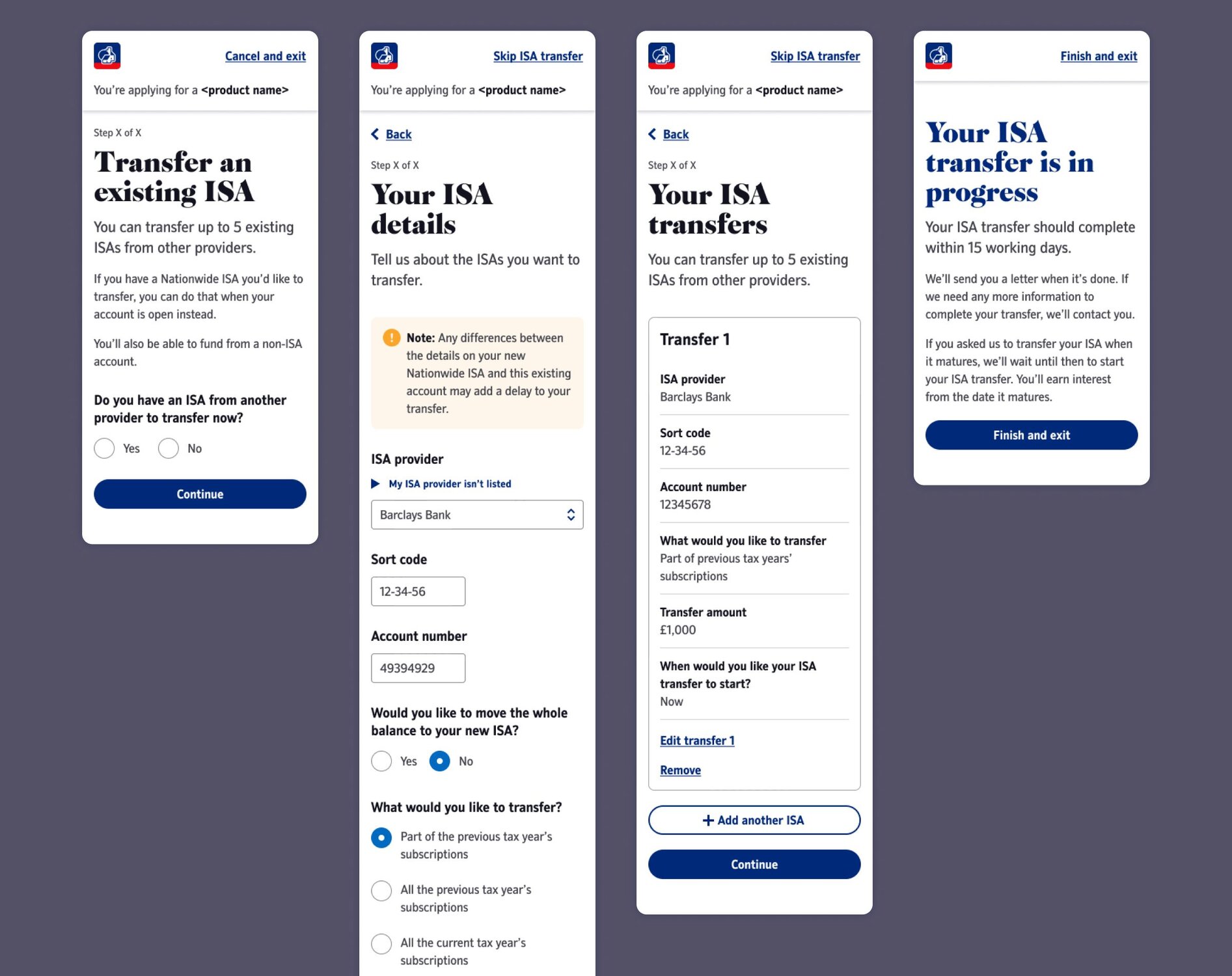
Several patterns had design variations between different savings products (e.g. ISA vs bond) or the application type. This is what the personal details page looks like for new vs authenticated users.
Competitor research
We then reviewed how similar interactions were handled elsewhere, looking at both direct competitors and broader digital services. This helped us challenge existing conventions, identify opportunities to simplify the experience and understand where Nationwide's current approach differed from established patterns.
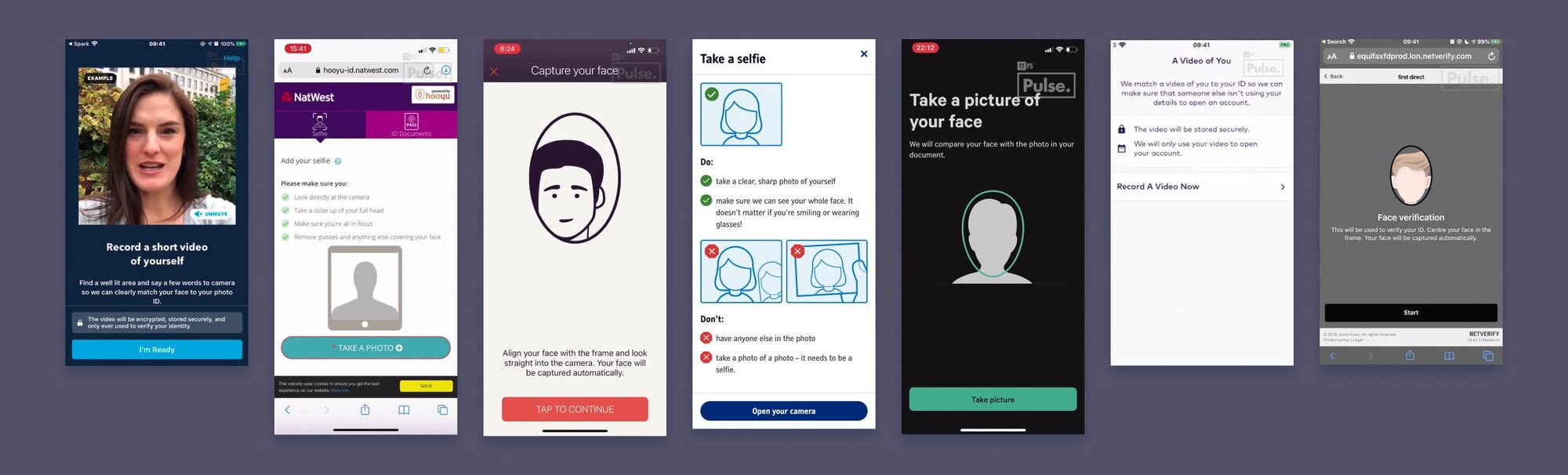
When working on the digital ID verification flow, we gathered extensive competitor references for each step. Here are seven examples of image or video capture instructions from a range of service providers.
Future-state workshop
I facilitated a two-day workshop with the project team to align on the future direction and prioritise the work. It focused on three exercises inspired by Collaborative Product Design:
- Goal mapping: identifying and prioritising the goals of the product and project.
- Future vision: understanding what was working today, identifying pain points and defining what success should look like.
- Pattern review: aligning on the purpose, features and constraints of each proposed UX pattern.
This gave us a shared understanding of both the problems we were solving and the constraints we needed to work within.
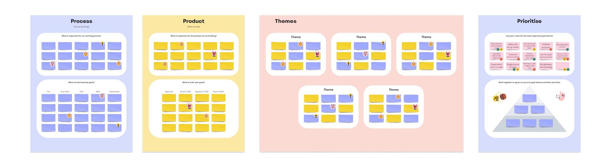
Workshop setup for the three-step goal mapping exercises
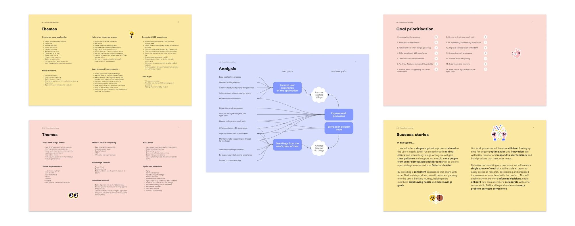
Selected pages from the final workshop report
Building the pattern library
With the research and workshop findings synthesised, we had a clear view of the current and target states, the principles behind each pattern and the relevant technical constraints.
I created a Confluence template covering the purpose and functionality of each pattern, alongside examples of how it was used. Each pattern included usability principles, accessibility considerations, task flows, content guidance and embedded Figma designs.
Over the following three months, the Experience Design team populated the library and worked with the wider product team to review and refine the proposed principles.
Addressing design debt
The work also exposed a significant gap between the existing and target experiences.
To make this actionable, I created a detailed report documenting the proposed changes for each pattern and set up a shared worksheet to categorise, prioritise and track the resulting design debt. I also established fortnightly sessions with the relevant teams to review and sign off changes.
This turned the pattern library from a documentation exercise into a practical roadmap for gradually modernising the existing experience.
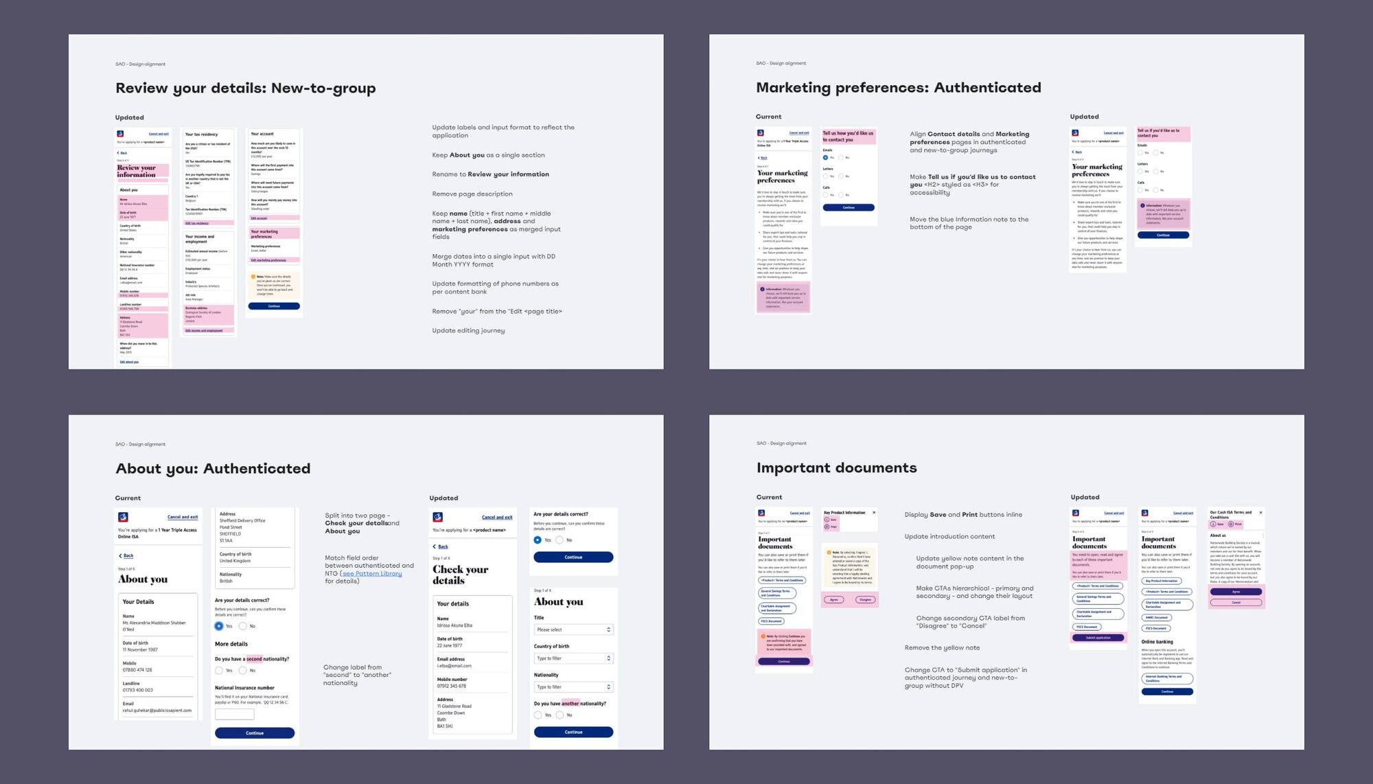
Selected pages from the design debt report
Conclusion
Modernising a large, established digital ecosystem rarely happens through a single redesign. It requires a shared understanding of the problems, a clear direction and practical ways for multiple teams to move towards it over time.
The UX pattern library gave Nationwide's teams that foundation. It made inconsistencies visible, captured the principles behind a better experience and provided a shared reference for future work.